
In today's digital landscape, responsive design ensures optimal user experiences across devices of all shapes and sizes.
CSS media queries are pivotal in achieving responsiveness by allowing designers to apply styles based on device characteristics such as screen size, orientation, and resolution.
Several online tools have emerged to simplify creating media queries, offering intuitive interfaces and customizable options.
Explore the best CSS media query generators online to streamline your responsive design workflow.
AtMediaQuery Generator
AtMediaQuery Generator provides a user-friendly interface for creating CSS media queries tailored to specific device parameters.
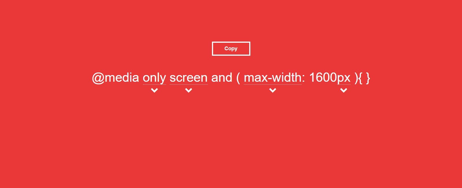
With options to customize breakpoints, device orientation, and pixel density, this tool empowers designers to fine-tune responsiveness with precision and ease.
Giona Media Query Generator
Giona Media Query Generator simplifies creating responsive CSS with its intuitive interface and comprehensive options.
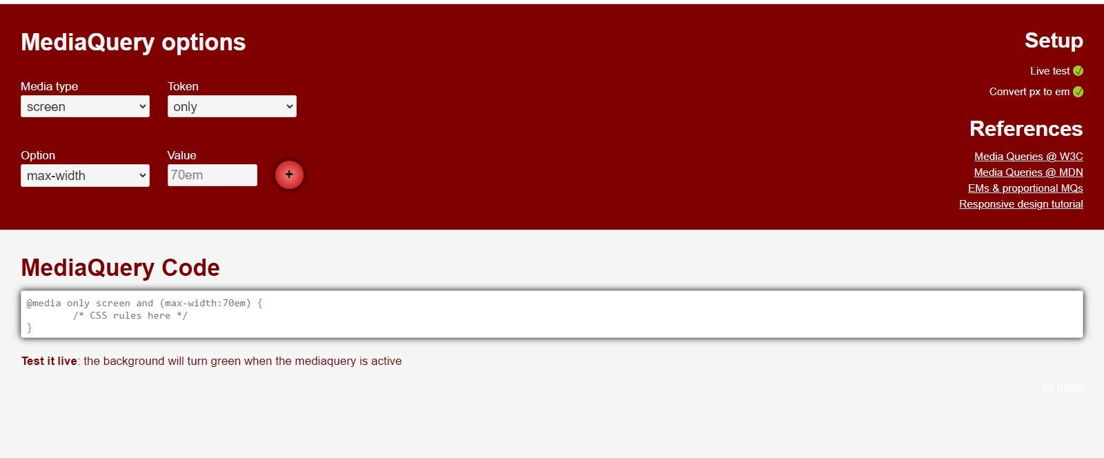
Designers can easily specify breakpoints, device features, and custom media query rules, ensuring compatibility across various devices and screen sizes.
CSS Media Queries
CSS Media Queries offers a straightforward approach to generating responsive CSS code.
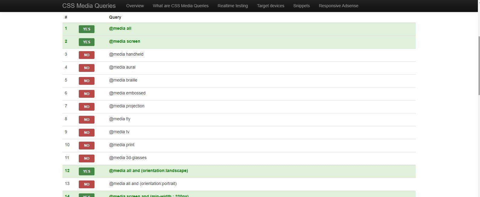
Designers can define breakpoints, viewport features, and orientation preferences with real-time previews to visualize the impact of their media query settings.
SimpleCSS Media Query Generator
SimpleCSS Media Query Generator streamlines the creation of CSS media queries with its intuitive interface and customizable options.
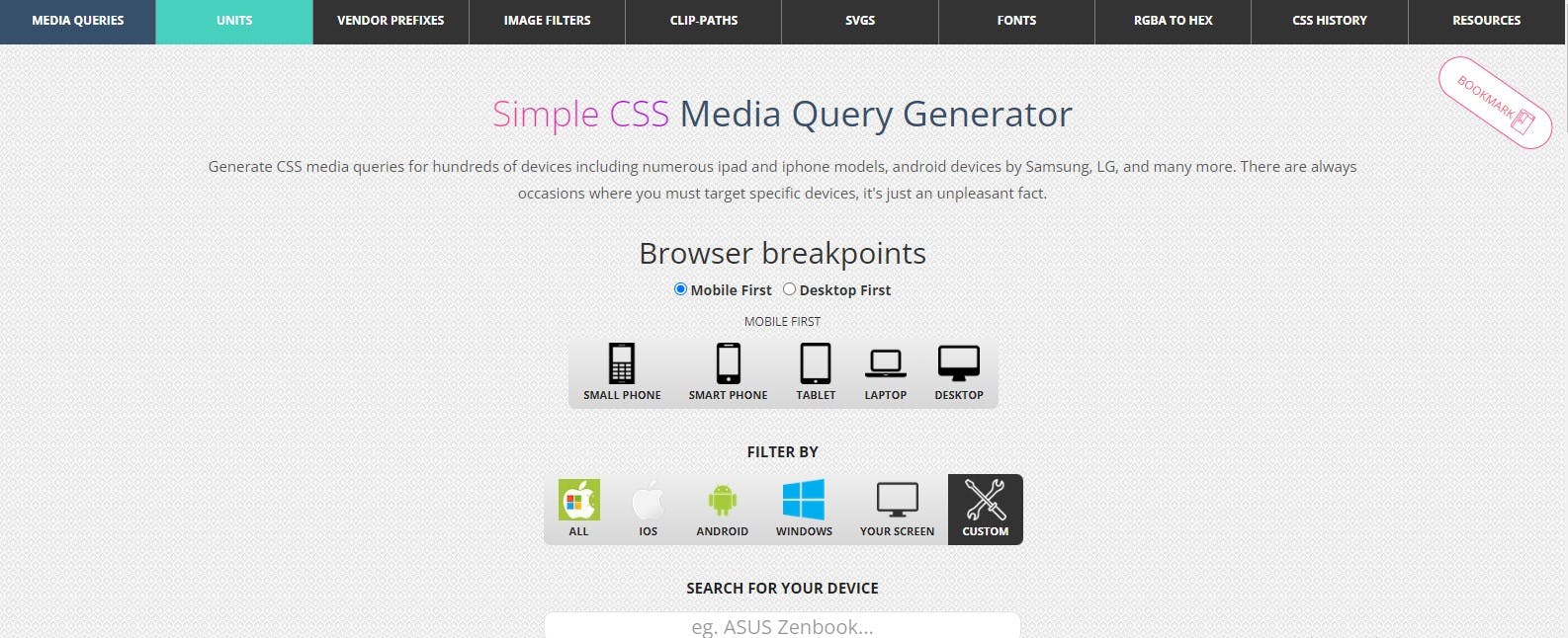
Designers can specify breakpoints, device features, and CSS rules, with instant code generation to incorporate into their projects seamlessly.
Creating responsive designs that adapt fluidly to various devices is essential in today's multi-device world. CSS media query generators are invaluable tools for simplifying this process, offering intuitive interfaces and customizable options to tailor styles based on device characteristics. Whether you're a seasoned developer or new to responsive design, these online generators empower you to easily create visually stunning and user-friendly experiences across devices.